
Colour in Photography

Blog entry
14th April
What do you know about colour?
Is this something that you consider when shooting or planning a photograph?
This blog is about the importance of colour, from understanding colour composition to photographing colour with either an iPhone or a camera.
The meaning of colour
Colours range from primary to territory colours and are used in photography as a non-verbal form of communication. Each colour can express a certain message or emotion in the viewer. Every colour has its own meaning & a selection of words that relate, but this can differ from person to person depending upon each viewers beliefs and culture.
Before you decide to use colour in your composition, list these colours below and create your own lists of what each colour means to you. I recommend this process because colours can either add to an image or influence a viewers opinion upon the meaning of the said photograph.
Colours & the words that I link to each one:
Red - Anger & Love
Blue - Calm & Peace
Yellow - Bright & criticism
Green - Self-reliance & possessiveness
Orange - Optimism & pessimism
Purple - imagination & immature

How to use colour within your composition
Within my explanation of the meaning of colour, I have explained that colour interpretation is useful in using colour as a symbol in photography. When using colour as a composition technique you need to consider the use of colour can add a dynamic element to your images that is very pleasing to the eye.

The main area to use when thinking about using colour as your composition technique is to learn what colours relate to these two areas: Complimentary Colours & Analogous Colours.
The meaning of complementary colours are two colours opposite each other on the colour wheel & analogous colours are colours next two each other on a colour wheel. You will find a combination of analogous colours when shooting a more natural photograph.
This may not make a lot of sense, as you may not have heard some of the terminologies I have used. The main thing to consider when using colour within your photography. Is to either use colours that help each other to stand out and these are more complementary colours, for example, orange & blue. These are colours that are opposite to one another, which means that they work well together when used to emphasise a dramatic element of your photograph.
Or you can consider using more harmonious colours that are a set selection of colours that can range from tonal value, for example, green to yellow.

Steve McCurry - Afghan girl
I hope by re-explaining the two colour combinations above this will lead you towards using colour to add a dramatic element to your photographs and you may start to consider the meaning behind the enhanced colour used within other photographers work. Take a look at this famous colour photograph, I’ll let you form your own opinion on the purpose of the colour used in this photograph.
Ask yourself:
Have they used either complementary or analogous colours?
Is there any duplication of set colours in this photograph?
If, Yes, is this a positive element?
Watch this video upon understanding this photograph.
Minimalist COLOR in your photographs, by The Art of Photography
Understanding Colour
The definition of colour is a component of light that is separated when it is reflected off of an object. Colour begins with light and the colours we see are influenced by the characteristics of the light source.
Watch this video on how we see colour within a photograph or art. By reading what I have explained and watching this video will help you understand further colour theory & colour combinations.
Lets us now consider how to use this composition technique at home
Here are some ideas on how you could start to practice this composition in your own home, with either your camera or phone.

Find Accent Colours - An accent colour is one that stands out against the other colours.

Use Colour To Frame Your Subject. Colour can often be used to create a visual “frame” around the subject.

Play with shadows on colourful backgrounds.

Use Colourful Backgrounds

Use The Blue-Yellow Combination - these two colours work nicely together.
Using filters.
How to use the filters
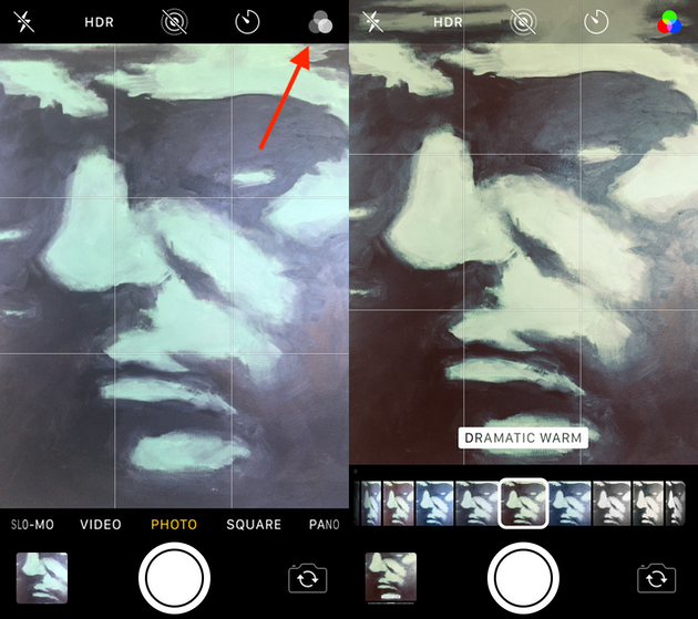
The filter setting in your camera is easy to overlook, but it’s right at your fingertips.
Here’s how to access it:
1. Open the Camera app
2. Tap the filters button (three interlocked circles in the top right-hand corner)
3. Scroll through your filter options
Once you have begun to practice colour composition you could go one step further and edit or use a filter. Most of us use our phones to take photographs, so I have included this extra section in this blog on how to edit on your phone and any possible apps you may like to use.
iPhone Filters
Your iPhone camera or phone camera has a range of filters that you can use once you have taken a photograph or during.
List of iPhone filters
Vivid pushes the contrast of the photo
Vivid Warm applies the Vivid filter but makes the image warmer/more yellow
Vivid Cool applies the Vivid filter but makes the image cooler/bluer
Dramatic bumps up the shadows and brings down the highlights
Dramatic Warm applies the Dramatic filter, but with a warmer tint
Dramatic Cool applies the Dramatic filter making the image cooler/bluer
Mono makes the image a simple black and white.
Silvertone makes the picture black and white, while also bumping up the shadows
Noir makes the pictures black and white, while dramatically increasing the contrast
APPS to use
Here are a few apps that you may wish to try and experiment with.

Image Filter ext. You can use the colour controls to enhance the colour of each photograph you took either through the app or editing from your gallery

Colorburn - This is a chargeable app, so make sure that you consider this before uploading or adding this to your iPhone. You will have access to 1000 colour filters, Split colour toning to a photograph and you can form coloured photographic grids.

VSCO: Photo & Video Editor - This app offer creative photo and video editing tools, inspiration, and a place for you to be. it has a range of filter tones to use and you can upload from this app to your social media avenues. You have the option to sign up for a membership.

Afterlight app - this app lets you use a variety of colour filters and you can paint colour in sections of the images. So selective colours pop from your pictures.
The apps I have mentioned above are just a selection that you can download onto your phone.
The main filter app that we all love to use is Instagram and ill be honest although I have found the apps mentioned above I mainly use Instagram filters if I use any. I prefer to edit by enhancing the colours in my photographs rather than using filters. This is my way and after reading this blog you will either try the apps or consider colour composition for each of your own coloured photographs.

GREEN

WHITE
Summary
At the start of this blog, I wished to explain the reason for using colour in your photographic composition. I have covered the meaning of colour and colour combinations between complementary or analogous colours. I do hope that this has helped upon starting your own understanding of how and when to use colour as a way to compose a planned photograph.
This composition technique is practised more frequently in adverting and product photography, as colours are used to express an emotion or to make a product stand out from a background.
I have included some phone and filter options in this blog as this seems to be a popular way to amend colouring per photo uploaded over social media. I do hope that the combination of colour consideration, filters and ideas to use with your phone may encourage you to be more playful with colour while at home. Remember there is no right or wrong answer as long as you are having fun.
WHAT NEXT?
Ready to experiment with colour in your photography? Dive into your next shoot by playing with complementary and analogous colours or using creative filters on your phone! Whether you’re working on product shots or simply capturing everyday moments, colour can elevate your images. If you’re eager to refine your skills or need more personalized advice, feel free to reach out for one-on-one photography coaching.
If you found this helpful, why not:
Subscribe to my blog for monthly tips, tricks, and styling inspiration to elevate your food photography.
Take Your Skills Further: Ready to level up? Explore my one-to-one personalized tutorials and transform your food photography.
Book a Session: Need professional shots for your brand? Let’s collaborate on your next food photography project!
GET IN TOUCH TODAY TO START YOUR JOURNEY!
If you enjoyed this blog, then please read any of my other blogs on Viewpoint, Leading line & Framing.